Button – WPF Tutorials step by step
Hello folks, Today I will explain you regarding Button control in WPF. I have already explained you regarding how could we create new project of WPF and basic structure of WPF project and Label in WPF.
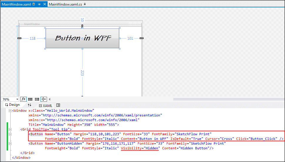
Lable is having below basic properties:
- Name: Could give name to button, which could be used in code behind as ID.
- Content : Content which will display in UI.
- IsDefault: Whenever user will hit Enter, this button would get trigger. Set in first button.
- Cursor: Could change cursor another than default, in first button we set cursor as “Cross”
- Visibility: There are three properties, Visible, Hidden and Collapsed, as you can see in the image second button’s visibility is set Hidden.
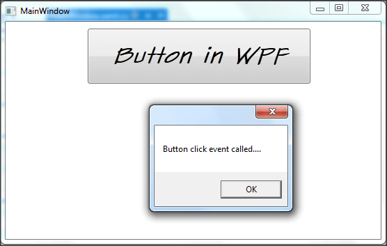
Below is the sample output of our code:
Let me know your feedback to improve and make it more informative.